
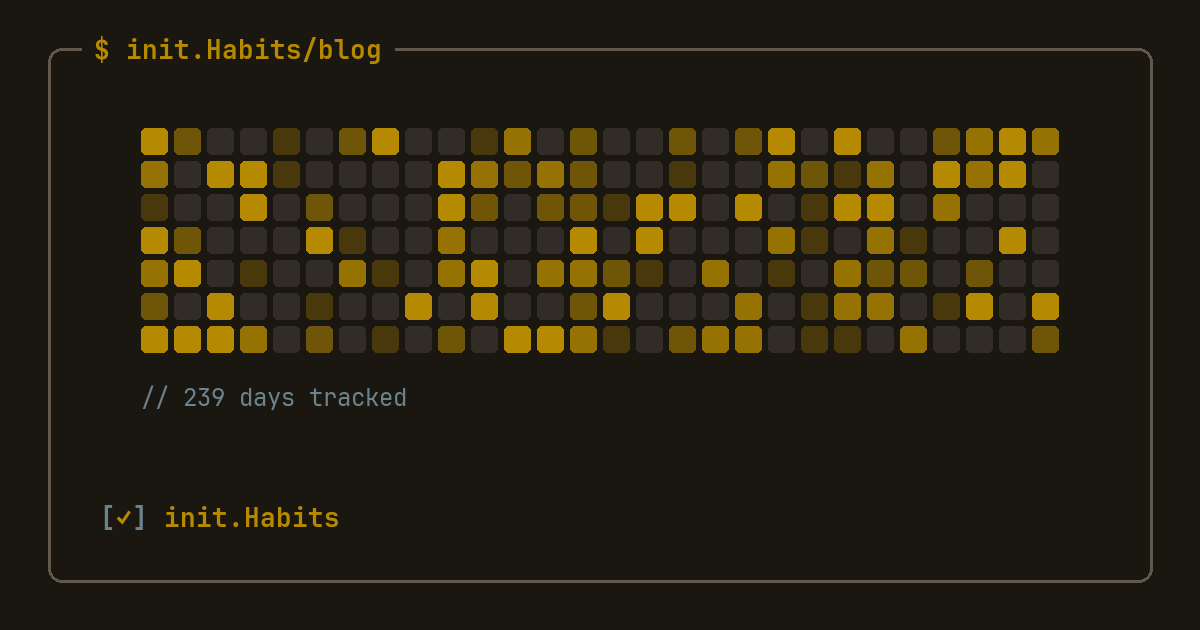
You open a habit app expecting a streak number, and instead you get a wall of small squares in different shades, some empty, some nearly black, arranged in neat columns. No number in sight. That's a habit heatmap, and once you know how to read it, the grid tells you more about your actual behavior than any counter ever could.
What is a habit heatmap, exactly?
A habit heatmap is a calendar turned into a grid: one small square per day, arranged in columns, colored by how much you did that day. A blank or pale square means little or nothing happened. A dark, saturated square means a full day. Scroll back far enough and you're looking at months of behavior compressed into a shape you can take in within a couple of seconds.
The format didn't start with habit apps. It's borrowed wholesale from GitHub's contribution graph, the small grid on every developer's profile page that renders a year of code commits as squares of green. GitHub documents the mechanic itself in its contribution graph guide: one cell per day, shaded by activity count. Habit apps borrowed the visual, not the audience. This isn't a developer feature — it works exactly as well for water intake or guitar practice as it does for commits. If you want the developer-specific angle, using the graph for coding streaks and IDE-adjacent habits specifically, the GitHub-style habit tracker piece covers that ground. This post is the plain-language version, for anyone.
How to read the grid
Three things to look for, roughly in order of usefulness.
Density, not individual cells. Don't scan for one perfect day. Scan for a region: does the last six weeks look mostly dark, mostly pale, or patchy? A heatmap rewards zooming out. One square tells you almost nothing. Forty of them tell you a season.
Shape, not just color. Real heatmaps develop shapes over time: a solid block during a focused month, a checkerboard during a chaotic one, a clean stripe if you only do the habit on weekdays. Once you learn your own shape, you start predicting a bad week before it happens, because the pattern usually shows up a few days before you'd admit the excuse out loud.
Where the pale runs sit, not just how many there are. Five pale days scattered across three months is nothing. Five pale days in a row is the start of something. The heatmap makes that distinction visible in a way a monthly completion percentage never will — two months at an identical 80% can look completely different once you see where the misses actually cluster.
Why the pale squares matter as much as the full ones
Most people read a heatmap backwards at first, hunting for the darkest squares and treating pale ones as evidence against themselves. That's the wrong read. A single pale square inside four months of activity is proportionate: it's one day out of roughly ninety, exactly as small as it should feel. The grid is doing you a favor by refusing to make that one day look bigger than it was.
Compare that to a streak counter, which does the opposite on purpose. Miss one day and the number resets to zero, collapsing three months of consistency down to nothing overnight. The heatmap keeps those ninety days visible even after the miss, so the visual weight of a lapse actually matches its real size instead of getting amplified into a crisis. This is the same logic behind earned streak freezes: both the shield and the heatmap exist to stop one off day from erasing everything that came before it, just through different mechanics.
Why a year view beats a weekly list
A weekly checklist is honest about this week and useless about everything before it. You can't tell whether this month beats last month, whether Sundays are quietly your weak point, or whether a slump three weeks ago actually recovered or just moved somewhere less visible. A year-long grid holds all of that in view at once.
| format | what it shows | blind spot | best for |
|---|---|---|---|
| daily checklist | today, in detail | everything before today | the day itself |
| weekly list | one week's pattern | seasonal trends, recovery | short sprints |
| year heatmap | months of pattern at a glance | fine detail on any single day | spotting trends, judging recovery |
None of these formats is wrong exactly. They answer different questions. The mistake is living entirely in the daily or weekly view and never zooming out far enough to see the trend those individual days are hiding inside.
Heatmap examples: what different habits actually look like
Picture three real habits over three months. A workout habit that's genuinely being kept shows up as a dense, slightly uneven block: mostly dark, with pale rest days that follow a rough weekly rhythm. A reading habit tracked by pages logged looks lighter overall, since a ten-page night renders paler than a fifty-page one; that gradient is exactly what the intensity dimension is for. A habit that's quietly dying looks different from either: a solid block for six weeks that thins into isolated dark squares surrounded by growing pale stretches, weeks before the person tracking it would say out loud that they've basically stopped.
That third pattern is the real value of the format. It surfaces a decline while it's still small enough to fix, instead of waiting for you to consciously notice "I haven't done this in a while," which tends to arrive much later than the grid already knew. For a fuller gallery of what specific habits look like on the grid — coding, workouts, reading, a streak that breaks mid-month — see habit heatmap examples.
The fastest way to understand any of this is to watch your own grid fill in. You can build a habit heatmap in your browser for free — add a few habits, mark off the days you did them, and see the shape emerge.
Reading your own heatmap without judging it
The heatmap works best as a diagnostic, not a scoreboard. When a pale run starts forming, the useful question to ask is "what changed," not "why am I failing." A new job, a move, a habit that was sized for a good week and never survives a normal one. The grid shows you that something shifted with more honesty than your memory will, but it doesn't tell you why, and treating three pale squares as a verdict on your character is exactly the reaction that turns a small gap into a real one. Look at the shape, ask what changed, adjust the habit, keep going. That's the entire workflow, and it works because the grid gives you distance from any single day, which is precisely what a raw streak number can't offer.
If numbers and totals are more your speed than a visual grid, tracking with real statistics covers the same idea through a different lens, and the features page has the full rundown of how heatmaps, streaks, and shields fit together. The grid itself renders in whatever editor theme you've picked, so the year you're looking back on doesn't have to look like a stock spreadsheet.
FAQ
What is a habit heatmap?
A habit heatmap is a grid of small squares, one per day, shaded by how much of a habit you completed that day. It's the same visual format as GitHub's code contribution graph, applied to any repeated behavior — workouts, reading, water, meditation — so a year of activity is visible at a glance instead of buried in a list or a monthly percentage.
How do you read a habit heatmap?
Look at density and shape across weeks, not individual squares. A solid block of color means a strong stretch; a checkerboard means an inconsistent one; a run of pale squares in a row, not scattered singles, is the pattern actually worth acting on. The grid rewards zooming out — one day tells you almost nothing, but a season of days tells you your real pattern.
Is a habit heatmap better than a streak counter?
They measure different things. A streak counter is a single number that resets to zero on any miss, which makes one bad day look catastrophic. A heatmap keeps months of context visible even after a miss, so a single pale square reads as the small thing it actually is. Most trackers, init.Habits included, show both, because the counter motivates on good days and the heatmap is what keeps you sane on bad ones.
Can I see a habit heatmap on my iPhone home screen?
Yes, if the app supports a heatmap widget. init.Habits puts the grid on the home screen so the current shape of your month is visible without opening the app, alongside a checklist widget for logging the day's habits directly from the lock or home screen.